Thursday, September 30, 2010
Homework #6: One Color
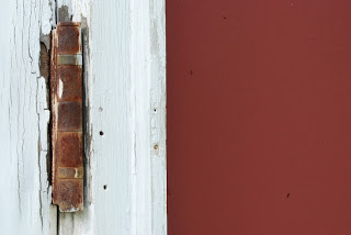
Here are my pictures and contact sheet for the one color homework. We had to go out and choose one of the primary colors, I obviously chose red, and see what we could find to photograph. I am a little late getting these up, but between 2 exams, a lab report and an away game in Rhode Island over the past two days I was lucky enough to find time to even shoot...so I'm not too happy with my shots, I literally had about 40 mins to shoot before our bus left yesterday, so this is what I found that was red within a 5 minute walk of the field house....
Tuesday, September 28, 2010
Tuesday, September 21, 2010
Homework #5: Time of Day
So our assignment was to go out and shoot at different times of day and find what something natural, residential and urban...
My natural, the sunflower, was shot at about noon
My residential, the sign, was shot at about 4 pm
My urban, the kid and bike, were shot at about 9:30 am
(These are unedited)
And here is my contact sheet for this project, I took a ridiculous number of photos so it was hard for me to pull out 36, especially cause I really like most of the pictures I took for natural and urban, and very few of my residential ones
Here is another urban picture just because since its probably the better picture with composition, color and everything else, but I love the expression on the kid's face so I'm probably going to use that one
Wednesday, September 15, 2010
Homework #4: White Balance
So, for this assignment we had to go out and take the same picture, once with the correct white balance setting and then one with the wrong setting. Super obvious which is which. This made me realize how important it is to actually be aware of this cause it can totally change an entire photo. It was kind of interesting because in class the other day when we were working on the 4x4 project I stumbled upon this issue while I was taking my photos. I started out with the correct balance for my photos but the shutter speed was too slow so I put my flash on and produced a blue tinted photo (1st set of photos below), which in the end is what I went with because I really liked the effect that it had and the mood it set. Kind of ironic that our next assignment was to do the same thing on purpose...
Tuesday, September 14, 2010
Favorite Classmate Scanner Photos
So, in class we had to go through everyone's scanner photos and pick out our favorite 2...
This one is by Mary. I really like the background, its one of the main reasons I picked this one. The way that the blurring goes from darker to brighter really contrasts the black rose and makes the rose more powerful than it would have been if the background had been in focus.
The next one I picked was by Topher. I really like the simplicity of the eggs, minimal color and the composition that draws your eye from the top to the bottom, and then you notice the "cracked" one in the corner. Clever.
Monday, September 13, 2010
Homework #3: Scanner Self Portraits
Here are my self portraits using a scanner as a camera. Actually turned out to be pretty cool trying to figure out what I thought would look cool and what actually looked good...
Thursday, September 9, 2010
The Kitchen and Visual Design: Top 2 (maybe 3) Photos
Here are my top 3 photos from homework #2. We're only supposed to have 2, so the 2 that I would be posting would be the eggs and the whisks, but I really like the cookie cutter picture except I wish the last corner of of the actually cookie cutter was in focus. I like that the focus is on only part of the spices/flour and the cookie cutter with the surrounding out of focus, I just really wish that corner was in focus and it would be a much better picture...so frustrating
Here are the edited/color corrected versions of the above pictures, my favorite definitely being the whisks in color:
Here are the edited/color corrected versions of the above pictures, my favorite definitely being the whisks in color:
Wednesday, September 8, 2010
The Golden Mean: Top 6 Photos
So here are my favorite 6 pictures from this assignment, they were taken either at the Beaver Damns or in College Woods
Subscribe to:
Comments (Atom)


